

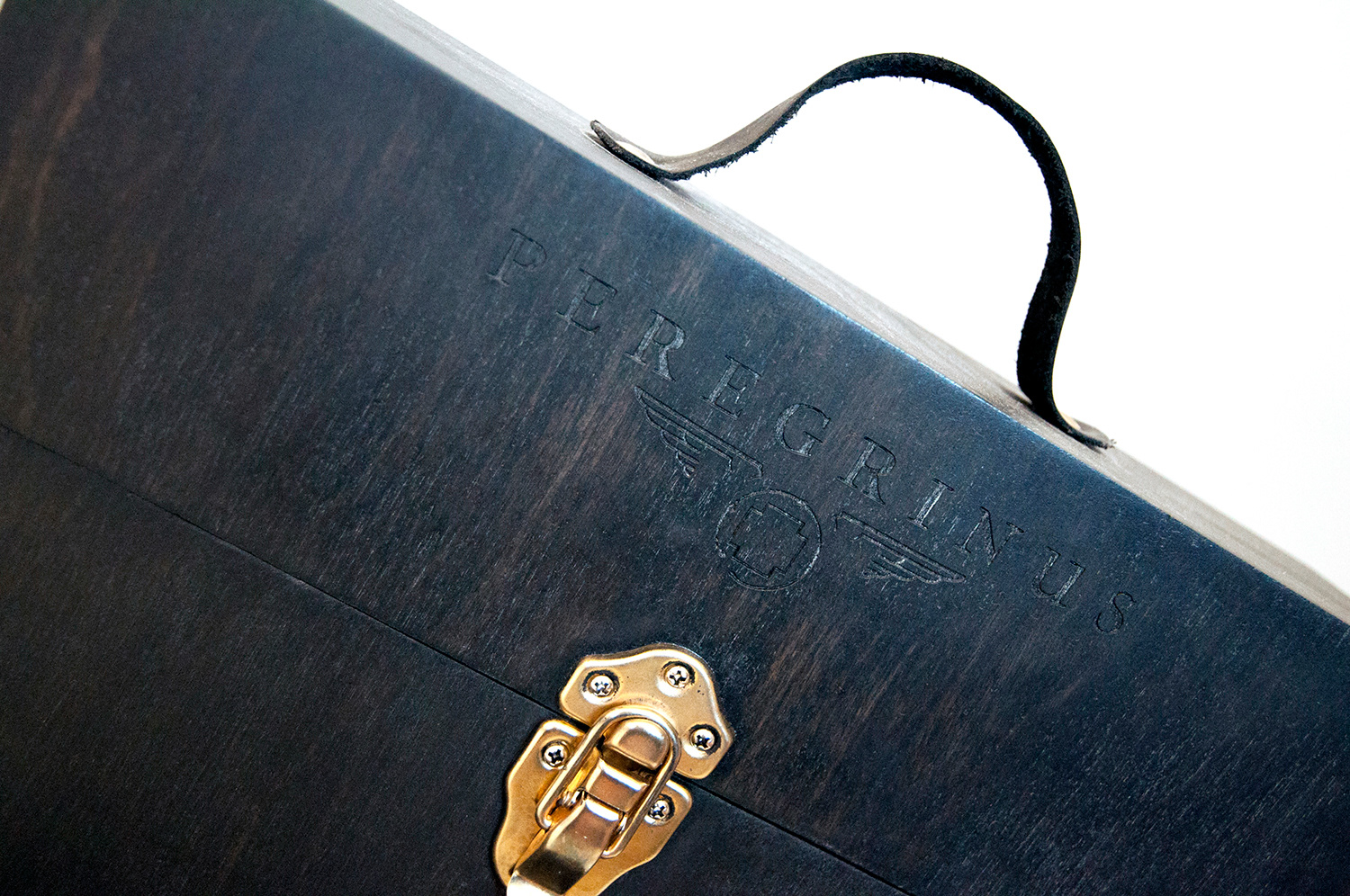
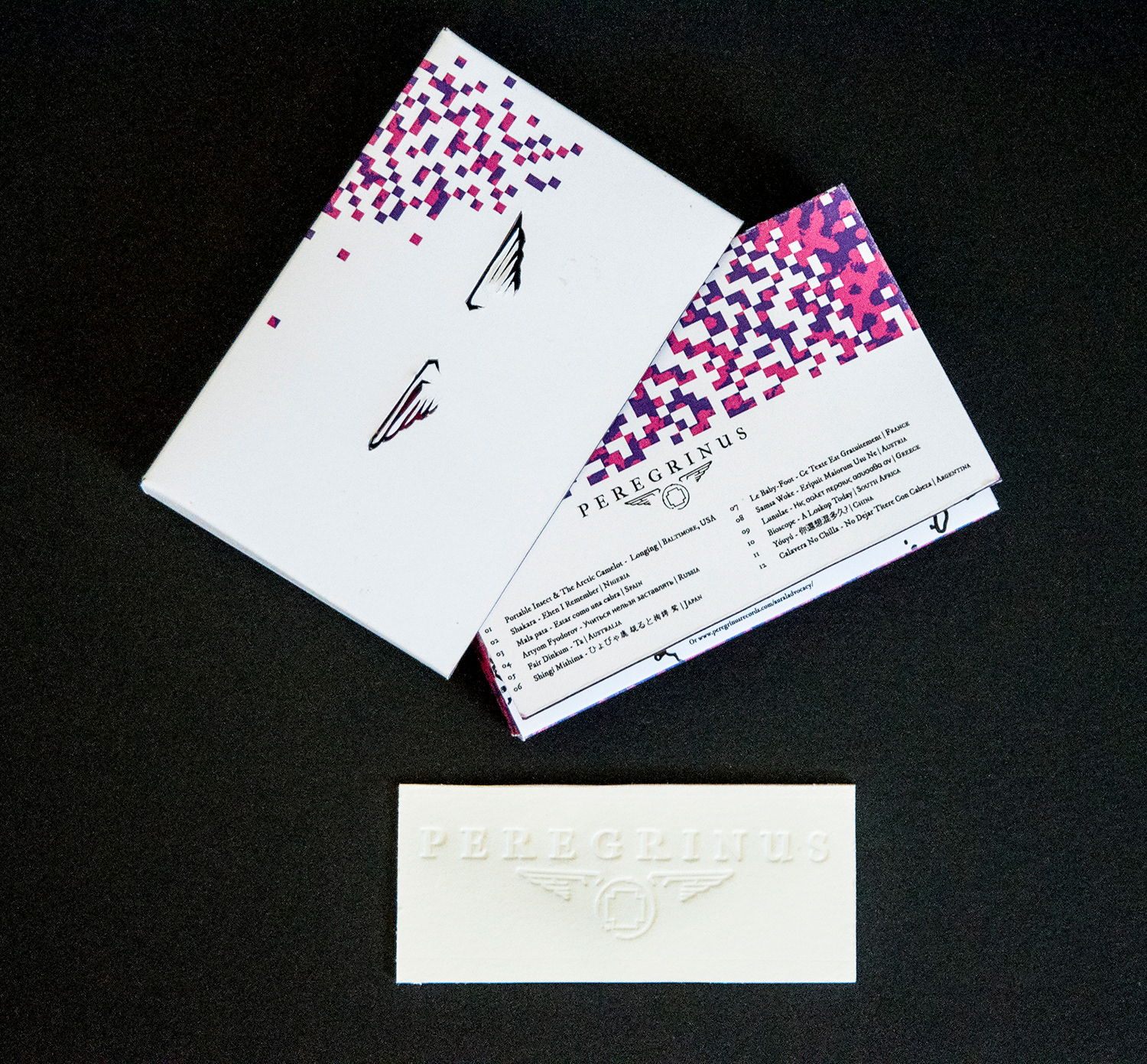
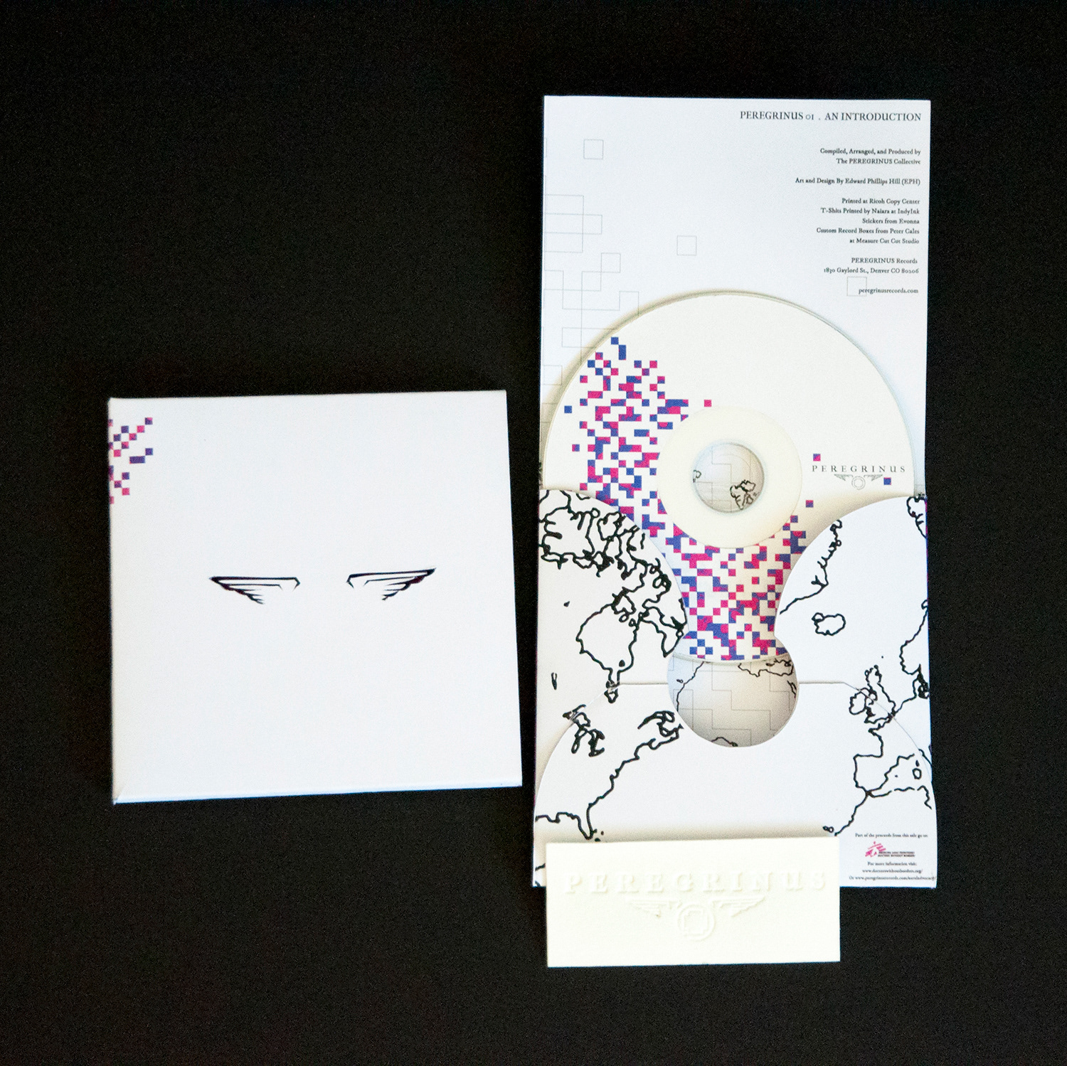
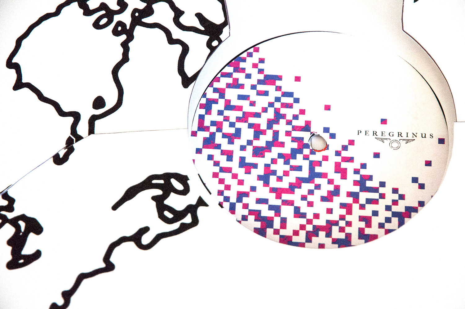
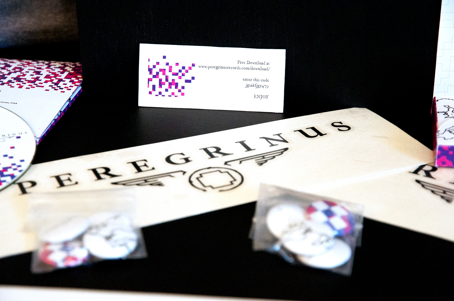
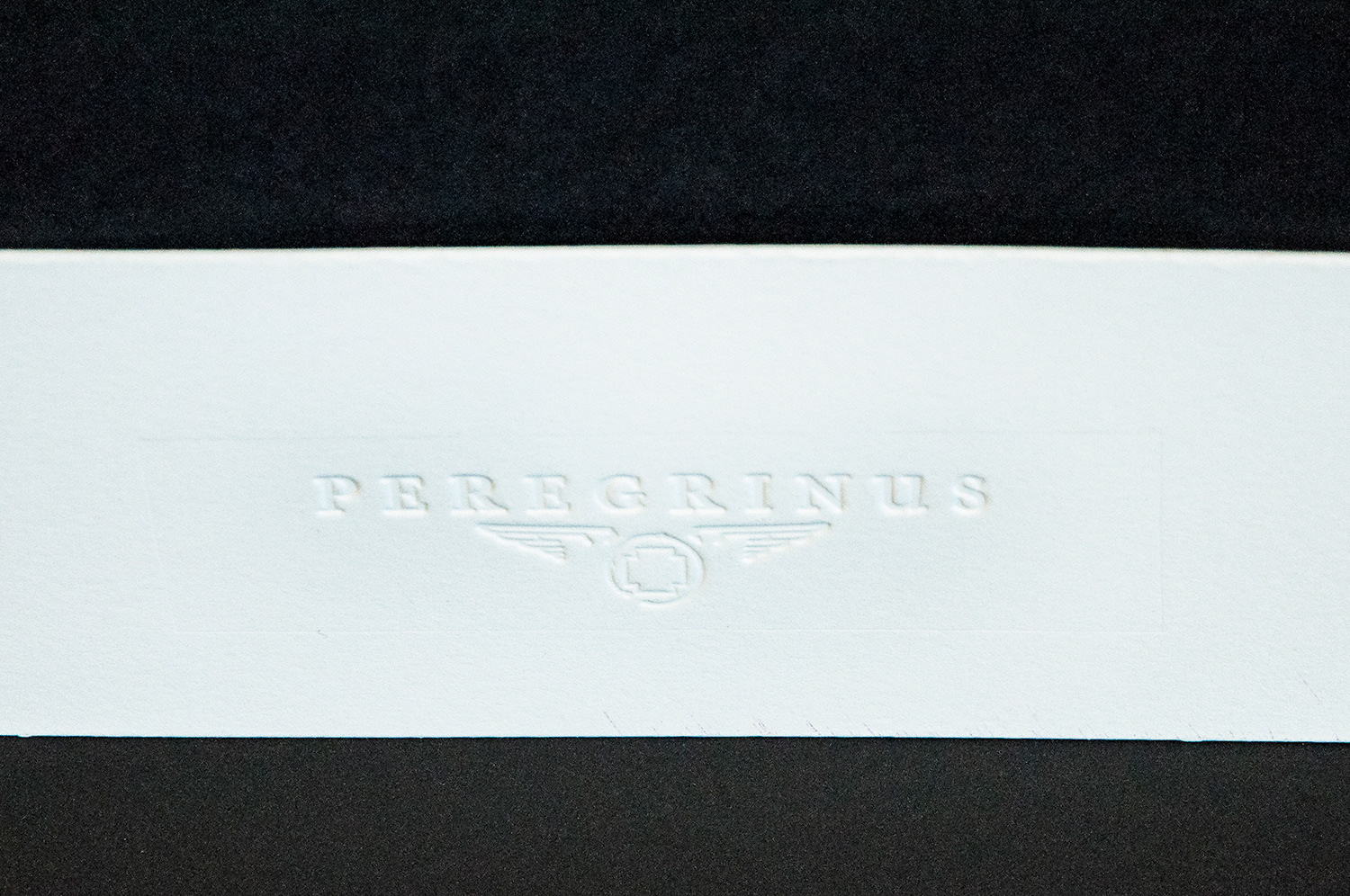
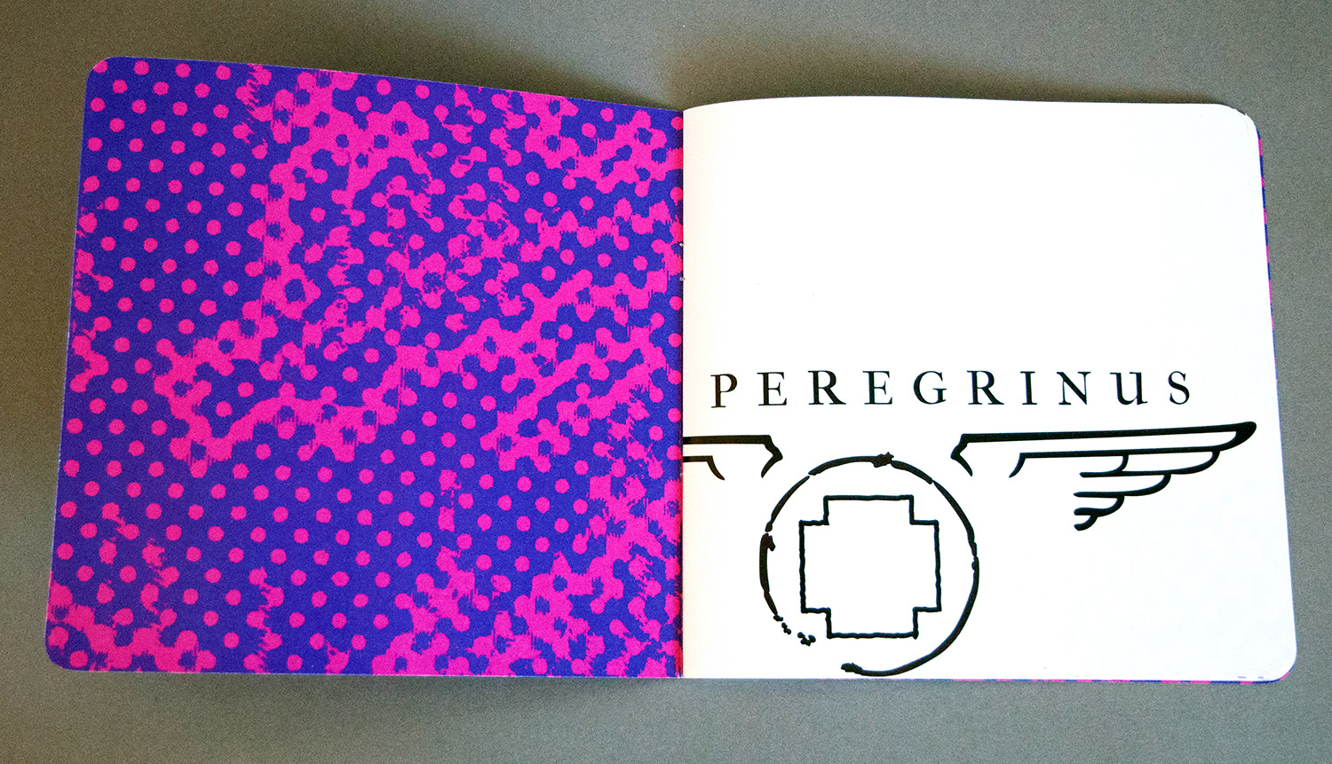
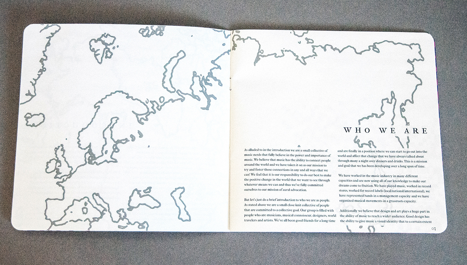
I created a record label entitled Peregrinus, a group of music aficionados that travel the world in search of unknown artists hoping to provide exposure for the artists and raise money for site specific charities in each location. I had a record carrier created which I branded and stained, made a prototype of a record, CD, and Cassette, and then branded a T-shirt, stickers, & pins. Branding, shown in detail below, was key to this project. It needed to exude professionalism, yet have a somewhat weathered or traveled look to it. I chose to use the IM Fell Type Family, a Google font that has a weathered look but is based upon a classic Didone serif font that has an elegant beauty. I also wanted to reference the travel and charitable aspects of my company. Hence for the mark I chose to emulate a mailing stamp and put a cross, which is one of the universal signs for aid and relief, in the center of my “stamp.” Additionally the stamp had to mirror the stamp in its weathered look as if it were an actual stamp that could have been used at a postal office.

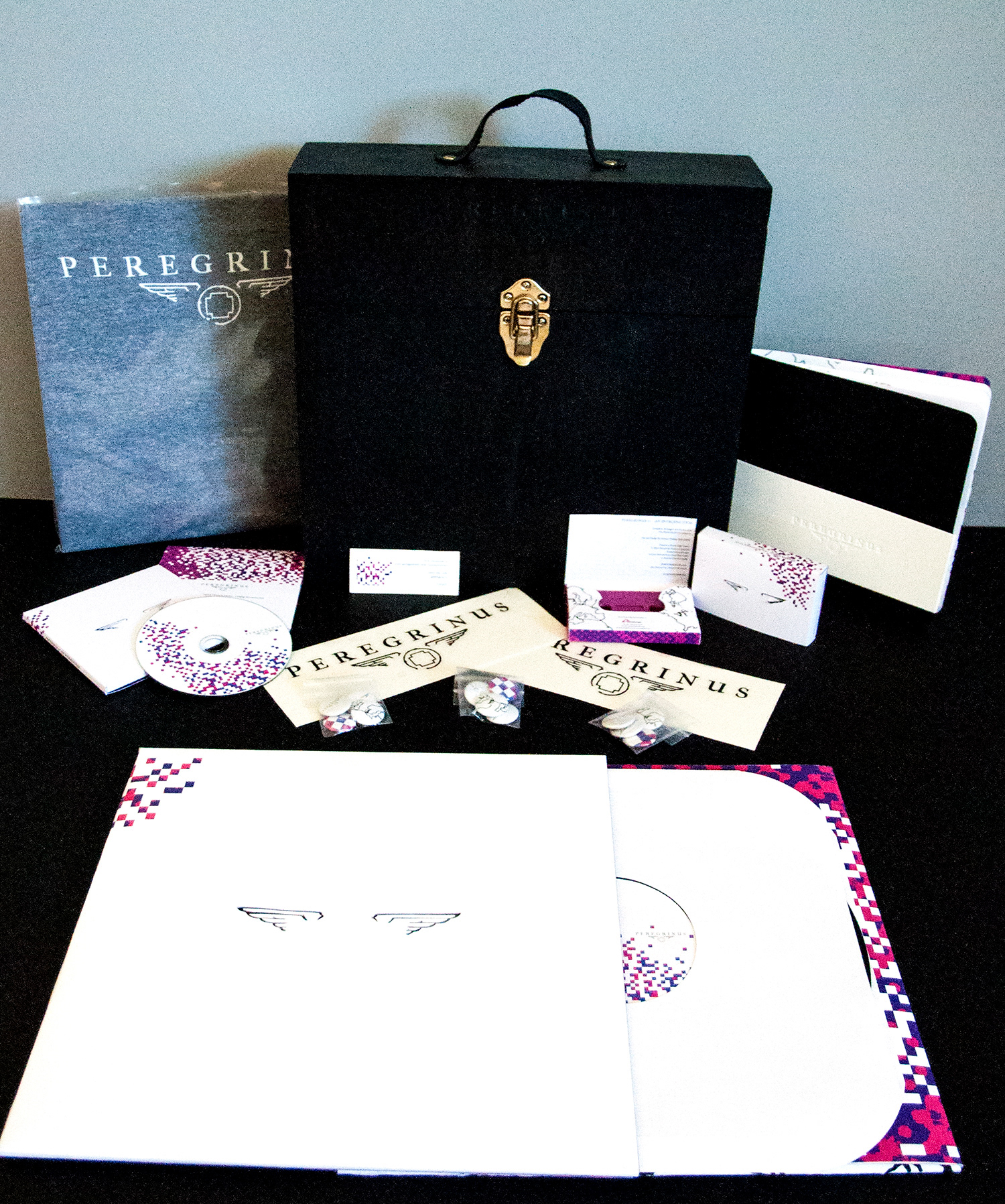

Product Photography by Natja Soave